Paint is one of the least expensive ways to meaningfully change how a room feels, which is exactly why it’s worth taking the time to choose a color deliberately rather than defaulting to whatever feels safe. This guide covers the palettes trending in living rooms right now, along with the practical factors that determine which one will actually work in your specific space.
Why Paint Color Matters More Than Any Other Single Change
Of all the changes you can make to a living room, wall color affects the overall mood and perceived size of the space more than almost any other single decision, and it’s reversible at a fraction of the cost of changing furniture or flooring. This makes it one of the lowest-risk ways to meaningfully shift how a room feels.
Warm Neutrals: The Current Default
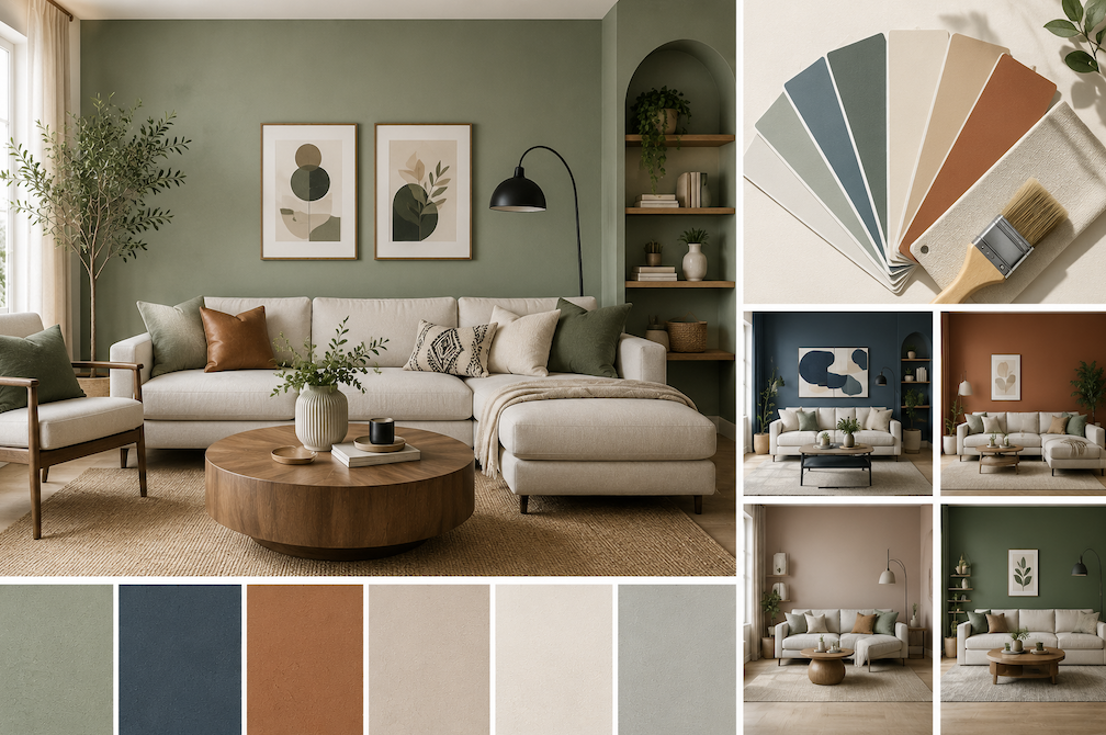
Warm neutrals soft beiges, warm greiges, and creamy off-whites have largely replaced the cooler gray tones that dominated interior design for much of the past decade. These colors read as warmer and more inviting than a stark white or cool gray, while still remaining versatile enough to pair with a wide range of furniture styles and colors.
Deep, Moody Greens
Deep greens, from forest tones to more muted sage-adjacent shades, have become a popular choice for living rooms specifically, offering a sense of coziness without the starkness that very dark grays or blacks can create. These work particularly well in rooms with good natural light, where the depth of the color reads as rich rather than dark and closed-in.
Terracotta and Warm Earth Tones
Warm, earthy tones like terracotta and clay have gained popularity as an alternative to both stark neutrals and cooler colors, offering warmth without leaning into a specific bold accent color. These tones tend to pair particularly well with natural materials like wood, rattan, and linen, making them a strong fit for rooms already built around a natural, textural aesthetic.
Soft, Dusty Blues
Unlike brighter, more saturated blues, softer dusty or muted blue tones have found a place in living rooms as a calming alternative to warm neutrals, without feeling as cold as a stark gray. These tones work well in rooms that get plenty of natural light, where a true, well-balanced color reads clearly rather than shifting toward a colder or muddier tone under artificial lighting.
How Lighting Type Affects Paint Color, Not Just Direction
Beyond natural light direction, the type of artificial lighting in a room changes how paint reads in the evening. Warm-toned LED or incandescent bulbs tend to enhance warm paint colors and can shift cooler colors toward looking slightly muddy, while cool-toned LED bulbs do the opposite, making warm colors appear flatter and cooler colors appear more true to their daytime look. Checking your painted sample under your room’s actual evening lighting, not just daylight, avoids a color that looks great during the day but off once the lights come on.
Understanding Paint Undertones
Nearly every paint color, even ones that look simply “white” or “gray” on a swatch, carries an underlying warm or cool undertone that becomes more apparent once it’s on a large wall surface under your room’s specific lighting. A paint that reads as a clean, neutral gray in the store can reveal a distinctly blue, purple, or green undertone once painted across an entire wall, which is one of the most common sources of paint color disappointment.
How Room Lighting Changes Color Perception
North-facing rooms receive cooler, more indirect light throughout the day, which tends to make paint colors appear cooler and slightly grayer than they do on the swatch. South-facing rooms receive warmer, more direct light, which can make the same color appear warmer and more saturated than expected. East and west-facing rooms shift throughout the day depending on the time of the paint viewing, changing dramatically between morning and evening light.
This is exactly why the same paint color can look noticeably different in two rooms with different orientations, even within the same house, and it’s a major reason testing paint in your specific room before committing is worth the extra effort.
Sampling Multiple Colors Side by Side
Rather than testing one color at a time across separate visits or orders, painting two or three finalist samples next to each other on the same wall allows for direct comparison under identical lighting conditions, which is far more reliable than trying to remember how a previous sample looked days or weeks earlier.
Testing Paint Before Committing
Painting a large sample swatch, at least a two-foot square, directly on the wall (rather than a small board) and observing it across a full day morning, midday, evening, and under artificial lighting at night gives a far more accurate picture than judging a small paint chip under store lighting. Testing on more than one wall in the room is also worth doing, since different walls receive different amounts of natural light throughout the day.
Choosing Color Based on Room Size
Lighter, warmer neutrals tend to make a smaller living room feel more open, while deeper, more saturated colors can make a small room feel cozier but also visually smaller if not balanced with adequate lighting and lighter accent elements. In a larger living room, a deeper or bolder color is less
likely to feel overwhelming, and can actually help ground a large, open space that might otherwise feel too vast or impersonal in an all-neutral palette.
Paint Sheens and Practical Household Considerations
Beyond the visual differences between finishes, households with children or pets often benefit from prioritizing a more washable finish like eggshell or satin over a flat matte, even if matte’s softer look is initially more appealing, simply because flat finishes are considerably harder to clean without leaving a visible sheen difference where they’ve been wiped.
Choosing the Right Paint Finish
Matte and flat finishes hide wall imperfections well and offer a soft, non-reflective look, but show marks and stains more easily and are harder to clean. Eggshell finishes offer a subtle sheen with somewhat better durability and cleanability, making them a common, versatile choice for living room walls. Satin finishes offer more durability and easier cleaning still, at the cost of showing more wall imperfections due to increased light reflection. Semi-gloss and high-gloss finishes are typically reserved for trim, doors, and cabinetry rather than large wall areas, since their high reflectivity tends to look overly shiny across a full living room wall.
Accent Walls vs Whole-Room Color
A single accent wall in a bolder or deeper color, paired with a neutral on the remaining walls, offers a lower-commitment way to introduce a trending color without the cost and risk of painting an entire room in it. Whole-room color, particularly in a deeper or bolder shade, creates a more immersive, cohesive feel but represents a bigger commitment both in cost and in how dramatically it changes the room if the choice doesn’t work out as expected.
Coordinating With Existing Furniture and Flooring
Rather than choosing paint color first and hoping it works with existing furniture, bringing a fabric swatch or a photo of key furniture pieces to the paint counter, or holding a large paint sample next to your existing flooring and furniture at home, helps avoid a color that clashes once everything is in the room together. This is particularly important for rooms with furniture or flooring you’re not planning to replace alongside the paint refresh.
Trim and Ceiling Color Decisions
A crisp white trim remains the most common and versatile choice for contrast against most wall colors, though painting trim the same color as the walls (in a slightly different finish) has become a popular alternative for a more seamless, modern look, particularly with deeper wall colors. Ceilings are traditionally painted white or a very light tint of the wall color, though a ceiling painted to match or complement the walls can make a room feel more enveloping, an effect sometimes sought out specifically to make a large or oddly proportioned room feel cozier.
Cost of a Paint Refresh vs a Larger Renovation
A full living room repaint remains one of the most cost-effective ways to meaningfully change a room’s feel, particularly compared to replacing flooring, furniture, or undertaking a structural renovation. For homeowners feeling like their living room needs a bigger update but working with a limited budget, a well-chosen paint color paired with a few updated accessories often achieves a similar sense of refresh at a fraction of the cost of a larger project.
Working With a Colorist or Designer If Needed
For anyone feeling overwhelmed by the number of available options, many paint retailers offer free or low-cost color consultation services, and some interior designers offer paid, hourly color consultations specifically. This is a reasonable middle ground for a homeowner who wants professional input without committing to a full design service for the entire room.
Common Paint Color Mistakes
Choosing a color based solely on a small paint chip, without testing a larger sample on the actual wall, is the most common mistake and the one most responsible for disappointing results. Ignoring the room’s specific lighting orientation is a close second, since a color chosen for how it looked in a well-lit store can shift considerably once painted in a room with different lighting conditions.
Sample Pots vs Peel-and-Stick Swatches
Beyond traditional sample pots requiring an afternoon of drying time, many paint brands now offer large, removable peel-and-stick swatches that can be repositioned around a room and viewed across different times of day without any painting or cleanup involved. These are a convenient starting point for narrowing down options before committing to painting an actual sample section on the wall for final confirmation.
Conclusion
Warm neutrals, deep greens, earthy terracotta, and soft dusty blues are the palettes currently trending for living rooms, but the right choice for your specific space depends more on your room’s lighting, size, and existing furnishings than on trend alone. Testing a large sample directly on your wall across a full day of lighting remains the single most reliable way to avoid an expensive color mistake.